Every US Zip Code – Decoded
Mapos Designer
Here at MAPOS we love a good map (just look at our name!), and this was one of the more interesting we came across recently. It was put together by the Washington Post from data compiled by the American Community Survey, the US Census Bureau, and ESRI.

The interactive visualization includes each of the 650 United States zip codes and assigns it a ranking and a color. The colors range from dark blue to light green, and the metric scale from 0-99. The number values are determined by averaging the percentile ranks of that zip code in both median household income and college education. The lighter the color, the higher the ranking. You can zoom in and out, pan around, and click on any of the zips for a detailed breakdown of the data behind the graphic.
From a purely aesthetic standpoint, the map works beautifully and is exceptionally good at making clear certain geo-economic truths of the country. The most obvious of which is the tendency of wealth to accrue around urban centers, with the bright spots almost perfectly mapping the major cities of the US. However, the longer you look, the more patterns begin to appear. For example, almost as soon as you notice that extreme wealth tends toward urban centers, you realize that so does extreme poverty. While these aren’t exactly secrets, its still amazing to see such a clear division, often with only streets dividing the highest and lowest ranking zip codes.
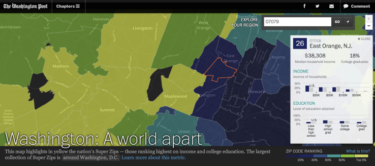
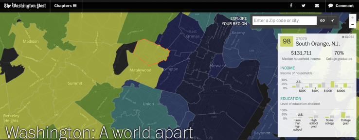
Of course, the map is only looking at two factors in its subdivision of an entire country (300 million people cannot be quantified in two stats), but they have a high correlation to wealth and power. In fact, it’s interesting to me that they specifically included higher education in the metric, not merely median household income. In a way this seems like a suggestion that money alone is not enough to accurately highlight where the power lies in this country: the article attached to the graphic goes on to discuss the significant number of “super zips” clustered around Washington DC, so there seems to be some truth to that sentiment.
Without getting too embroiled in the various social, economic, and political discussions its possible to jump into from this graphic, lets just go ahead and enjoy it for what it is: a gorgeous and fluidly interactive map of the country with data that is now public, using technology that didn’t exist 5 years ago. As the federal government releases more data like this, and the tools of HTML become increasingly advanced and accessible, I just hope that designers can keep up the pace.