‘Wichcraft
In 2015 Tom Colicchio and Sisha Ortuzar wondered how to remind consumers of ‘Wichcraft’s leadership in fast casual. Their brief to Mapos proposed redesigning ’Wichcraft spaces to more strongly communicate the brand’s commitment to locally sourced natural food, and to the well-being of supporters ranging from farmers to kitchen employees and customers. Our reinvention would fully come to life in a new ’Wichcraft location, and roll out to new and renovated locations throughout New York and the East Coast.
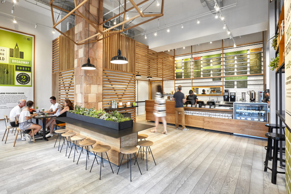
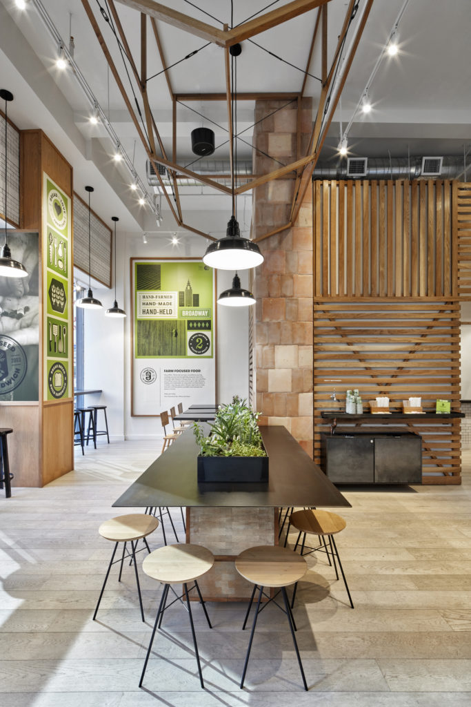
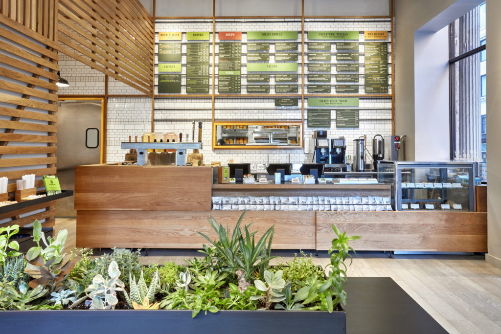
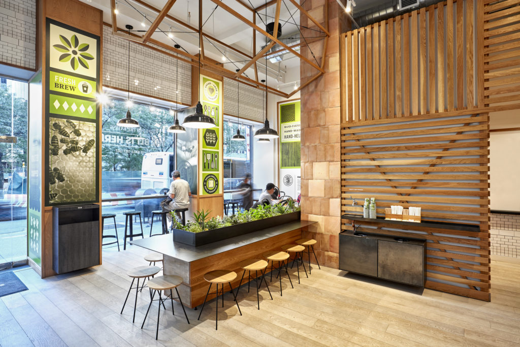
Ceramic and terracotta tiles recall bread ovens, and the irregularly stacked oak forms of the counter and dais pedestal suggest produce crates.
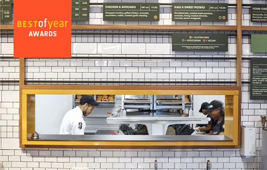
To enhance legibility, we set the menu against white ceramic and oak. The board’s tiled signage is modular, and can be reconfigured quickly to reflect seasonal items.

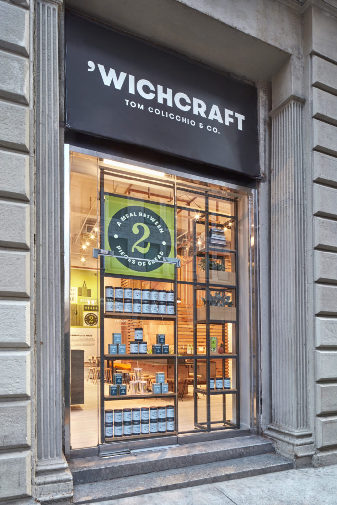
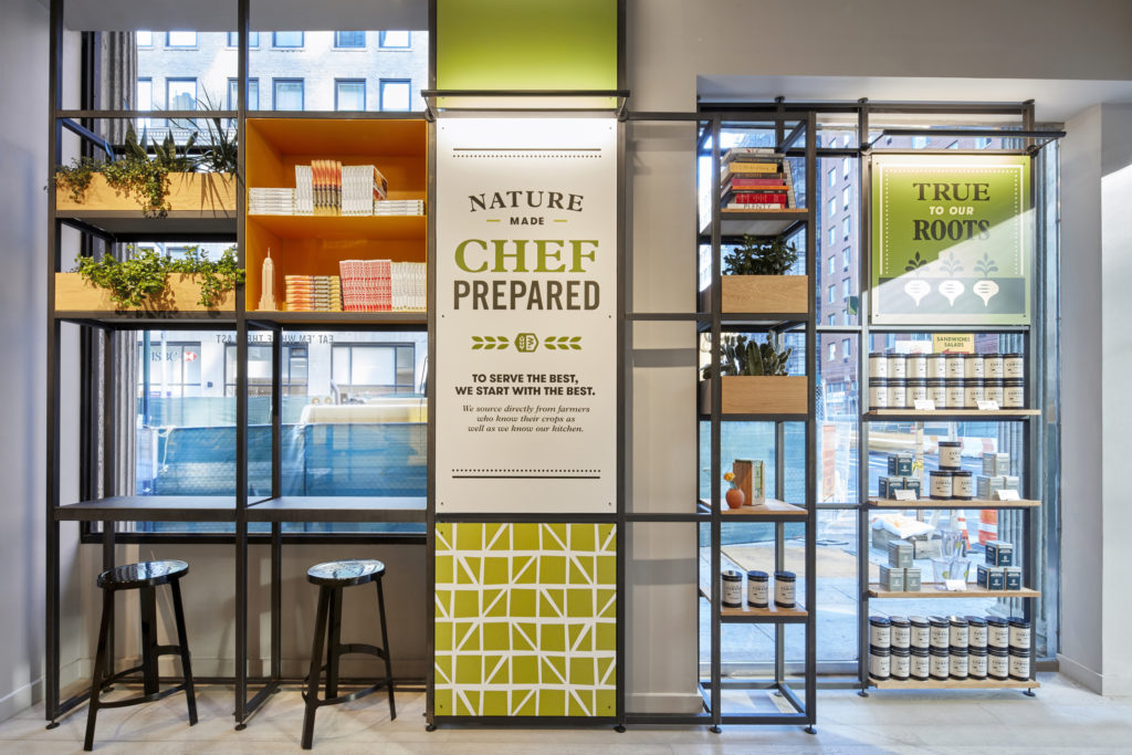
The Market Wall places branded merchandise and graphics at the most prominent wall, and in effect becomes an extension of the exterior ‘Wichcraft sign.


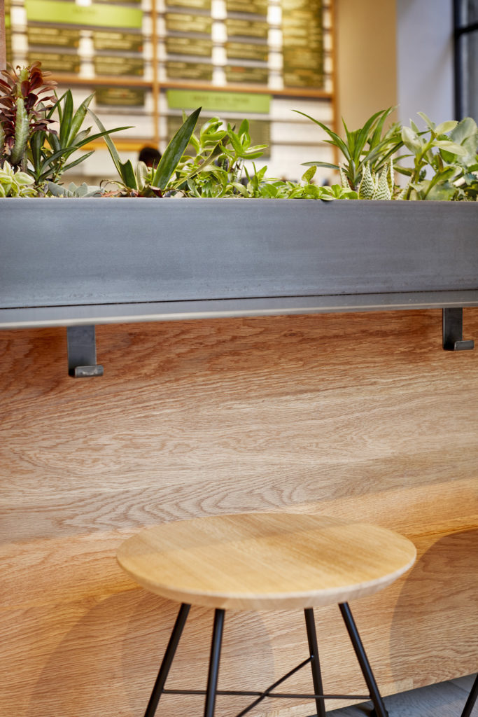
Planters remind guests of natural ingredients’ seasonality.