Block by Block, Year by Year
Mapos Designer
This amazing interactive map shows the construction date of every building in Brooklyn, New York (some 320,000). Developed by Thomas Rhiel at BKLYNR, and based partially on the NYC Department of City Planning’s newly released PLUTO data set, the map is an incredible resource and a fascinating visualization of the most populous borough of America’s largest city.
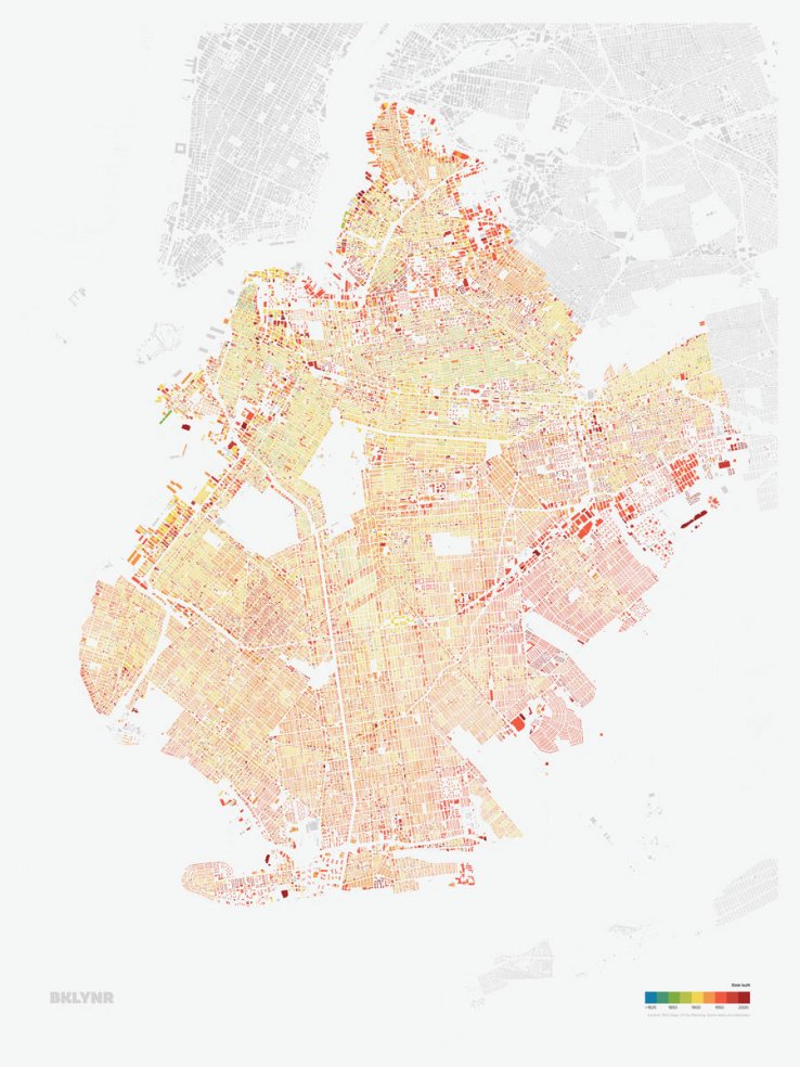
Along with the specific construction date, the map color codes each building by period, from pre-1825 through today. My apartment is in a dark red building circa 2010, but adjacent to a light green one from 1899. My neighborhood, Greenpoint, is a mix of structures from the late 19th century and early-mid 20th century, with new 21st century buildings interspersed.
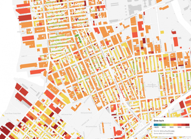
And this is perhaps the most interesting aspect of the map — the color coding giving an immediate sense of the relative age of a specific area. Sit a little further back, and the rough age of each neighborhood emerges.
This combination of the macro and the micro, the general and the specific, is made possible by the map’s interactivity and is a great example of publicly available data presented in an intuitive, useful, and fun way.
How old is your office, home, or school?